
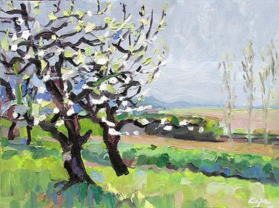
Here’s the last painting which had a strong tonal theme of black tree-trunks/white blossom.


Here’s the greyscale is changed by darkening the mid-tone grey in PS.

Using Photoshop elements to help painting
It’s more stormy with the white blossom more dramatic. But it wasn’t exactly like that whilst painting ‘en plein-air’….it was more like the first greyscale…. sometimes it’s difficult to break off from copying ‘mes petits sensations’ (Cézanne – meaning enregistering the optical data for each little glance, each little staccato perception bounced back).
Do I have a problem getting my tonal values right?
As a colourist, I tend prioritise colour over value. Heighten, exaggerate the colour. I like very much the simplicity of what the english watercolourist Trevor Chamberlain, said – ‘I’m basically a tonal painter with colour laid over the top’. Could I say that I’m basically a colourist with a high tonal contrast laid over the top? This is probably too intellectual? The truth often eludes recipes & descriptions & I find that no two paintings unfold in the same way.
Or maybe it’s a badly exposed jpeg?
Maybe I should do some black & white oils?
Maybe I should use one eye for colour & the other eye for tone! LOL (in fact that’s morre or less what scientists are saying about rod & cone receptor cells in the eyeball).
Off to paint in the orchard now, with a nice bright but overcast light today, with no shadows & little tonal contrast. No more blossom.